
After more than a decade under the same campaign platform, the Tennessee Department of Economic and Community Development (TNECD) was ready for a new chapter. They needed a fresh identity and campaign direction that captured the energy of a state with real momentum.
I designed the logo, brand guidelines, and ad campaign, building the work around an idea that connected Tennessee’s cultural identity with the business story it wanted to tell. The result was work that felt more energetic, more ownable, and less predictable than the usual economic development advertising.
Experience High Volume
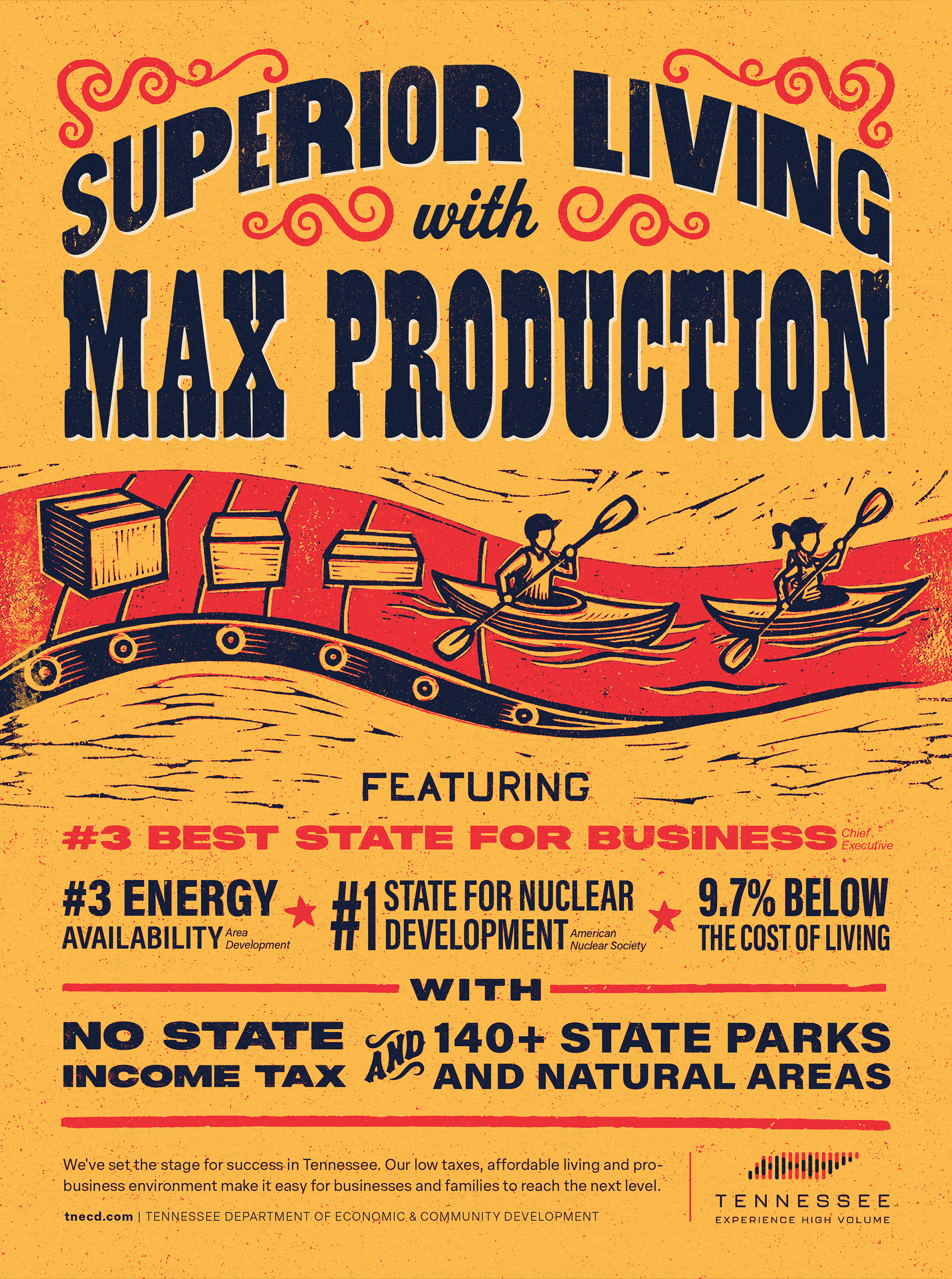
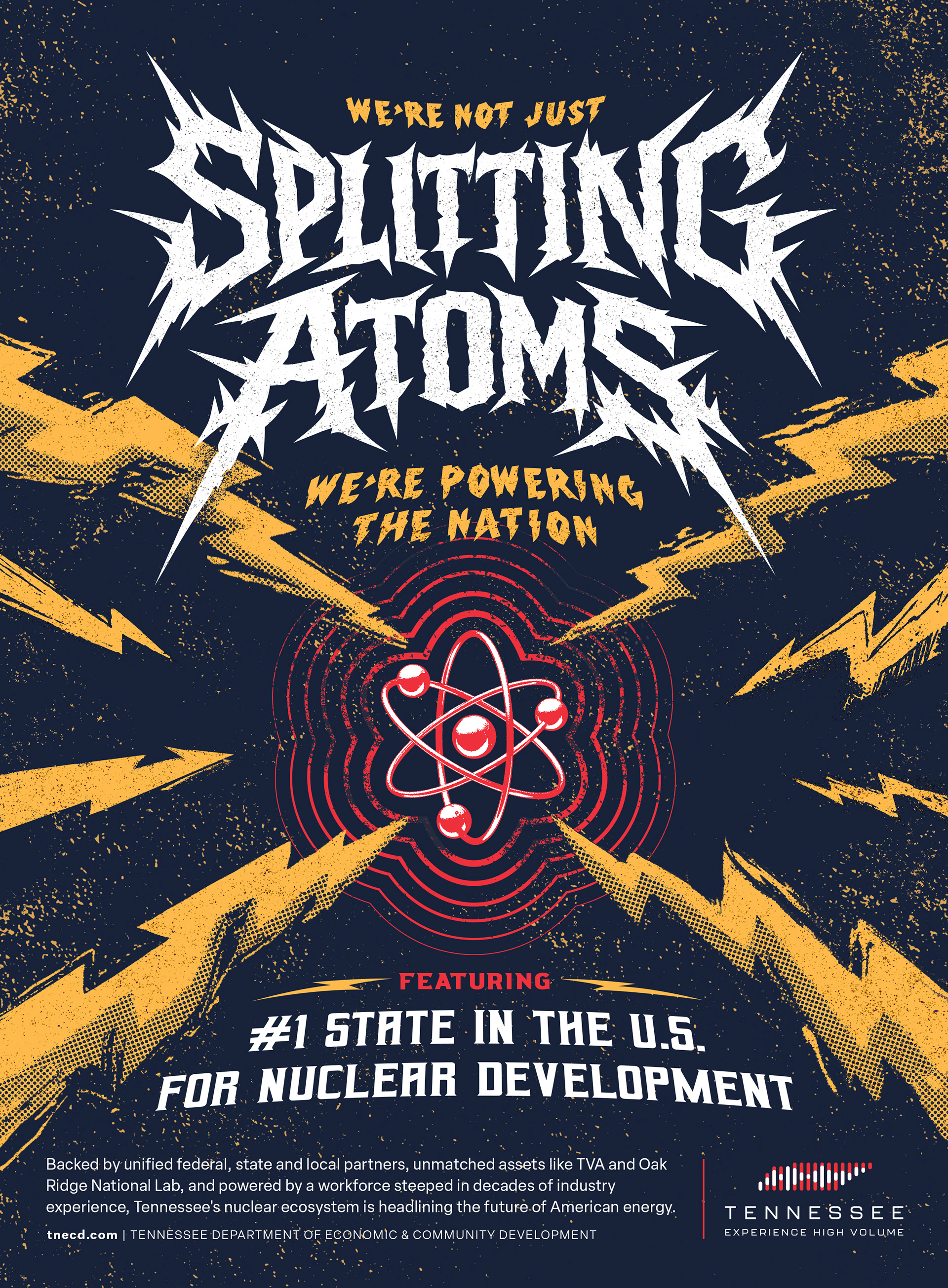
The campaign centered on the line Experience High Volume and used Tennessee’s music culture as the creative way in. The ads were built to look like band posters at first glance. Read a little closer, and they reveal themselves as ads for Tennessee.
That visual misdirect gave the campaign its edge. Bluegrass-inspired posters spoke to quality of life and business climate. A metal-inspired execution framed Tennessee’s leadership in nuclear energy. Across the campaign, headlines highlighted select words that looked like band names, while the full message sold the state. It let the work feel familiar, surprising, and distinctly Tennessee all at once.
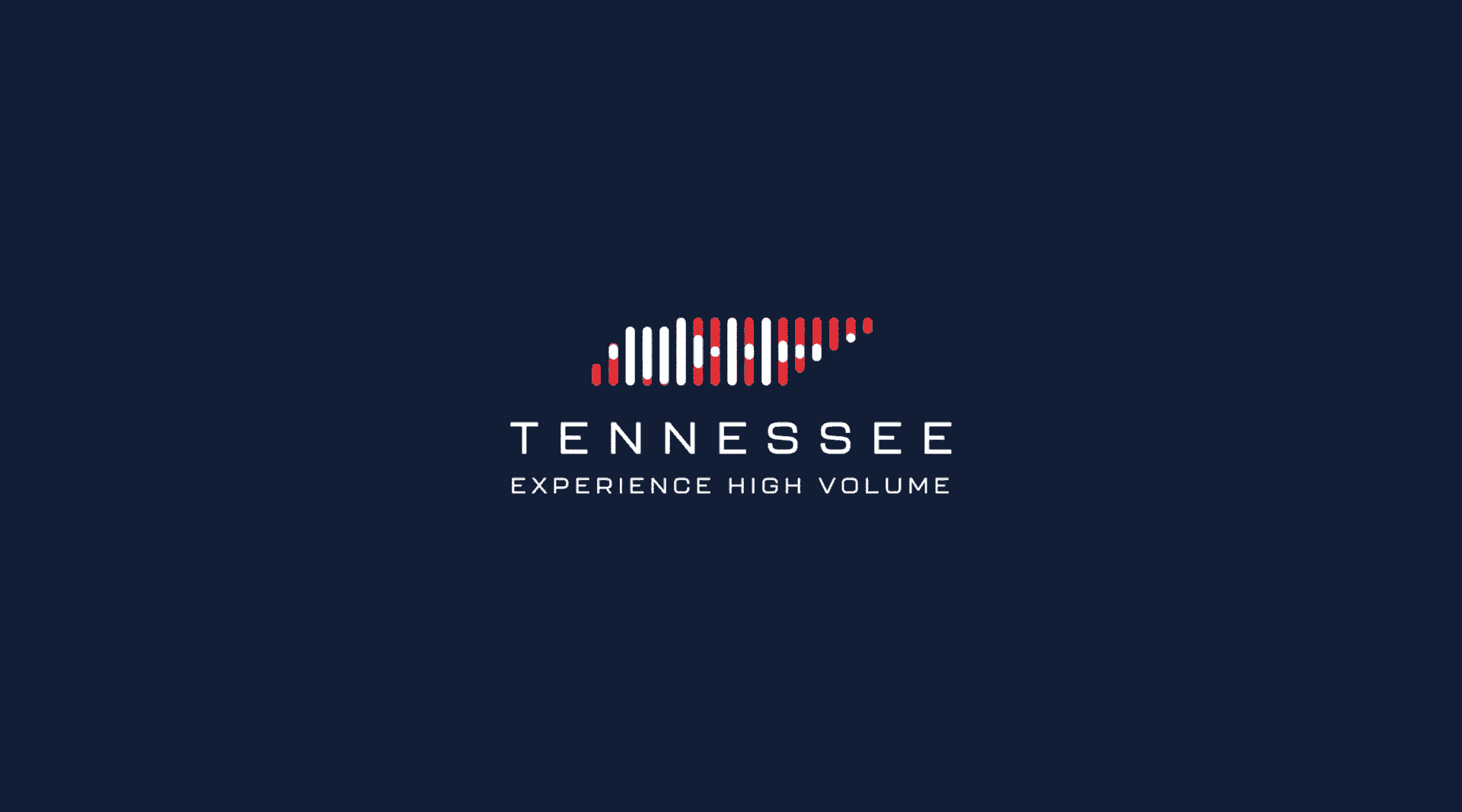
A logo with volume
Alongside the campaign, I designed a logo and brand system that carried the same energy forward. The mark uses the shape of Tennessee built from sound waves, giving it a sense of motion and personality that tied directly back to the platform.
The final identity felt modern, energetic, and unmistakably Tennessee, and it went on to win a Gold ADDY at the Nashville AAF Awards.