
As Realtracs expanded into more competitive Southeast markets, the brand needed more than a few polished assets. It needed a clearer identity, a stronger digital presence, and a system that could actually scale.
I extended their existing logo, type, and color palette into a much more complete brand world—one that felt approachable, modern, and distinct from the sea of lookalike MLS brands. The work stretched across web, illustration, collateral, social, motion, and conference materials, helping Realtracs show up with more clarity and a lot more personality.
The result was a broader, more cohesive brand presence that contributed to a 46% increase in website users and a 659% rise in Facebook engagement.
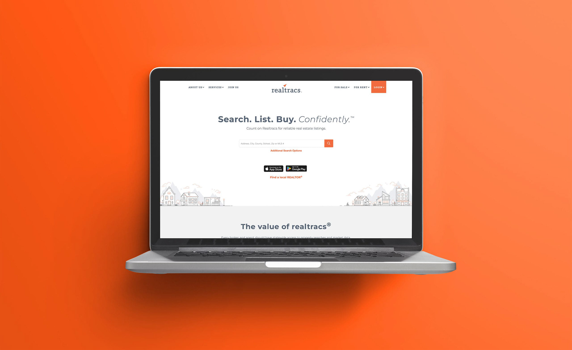
A website built from the ground up.
Realtracs wasn’t just looking for a visual refresh. The website needed to feel easier to navigate, more contemporary, and more aligned with where the brand was headed.
I designed the site from top to bottom, creating a digital experience that felt cleaner, friendlier, and more confident without losing usability. It gave the brand a stronger front door—and a much better first impression.
I designed the site from top to bottom, creating a digital experience that felt cleaner, friendlier, and more confident without losing usability. It gave the brand a stronger front door—and a much better first impression.
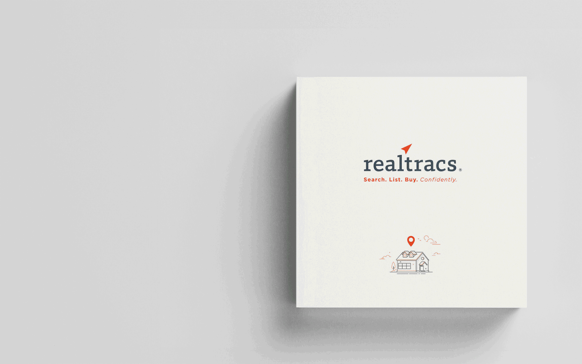

An illustration style that didn’t look like every other MLS
A lot of brands in this space tend to blur together. Realtracs had an opportunity to feel more human.
So I created a custom illustration system that was approachable, friendly, and a little more fun than what you’d typically expect from an MLS. The goal wasn’t just to decorate the brand. It was to give it a visual language people could actually remember.